Introduction
If web development is the back end support, then web designs are the front faces which represents a website. Website formats have changed a lot since its evolution and it will keep changing in future as well.
A web design needs to be highly updated and trendy in order to catch the complete focus of the client. Year by year the web industry is emerging out with new concepts of web designs and it is all about the organizations to embrace the right one.
A web design is not just a design composed of templates instead it also requires proper navigation features, content, speed, compatibility and much more. Same as web development framework it is all about the functionality involved in web designs and its proper usage.
Broken Grid Layouts
Innovative and out-of-box thinking are the two mandatory qualities for any kind of web designers. These two qualities need to be applied according to the requirement from the user side too. Whenever a designer opts for a catchy design then the grid layout stands in the front as the most reliable & recommended layout.
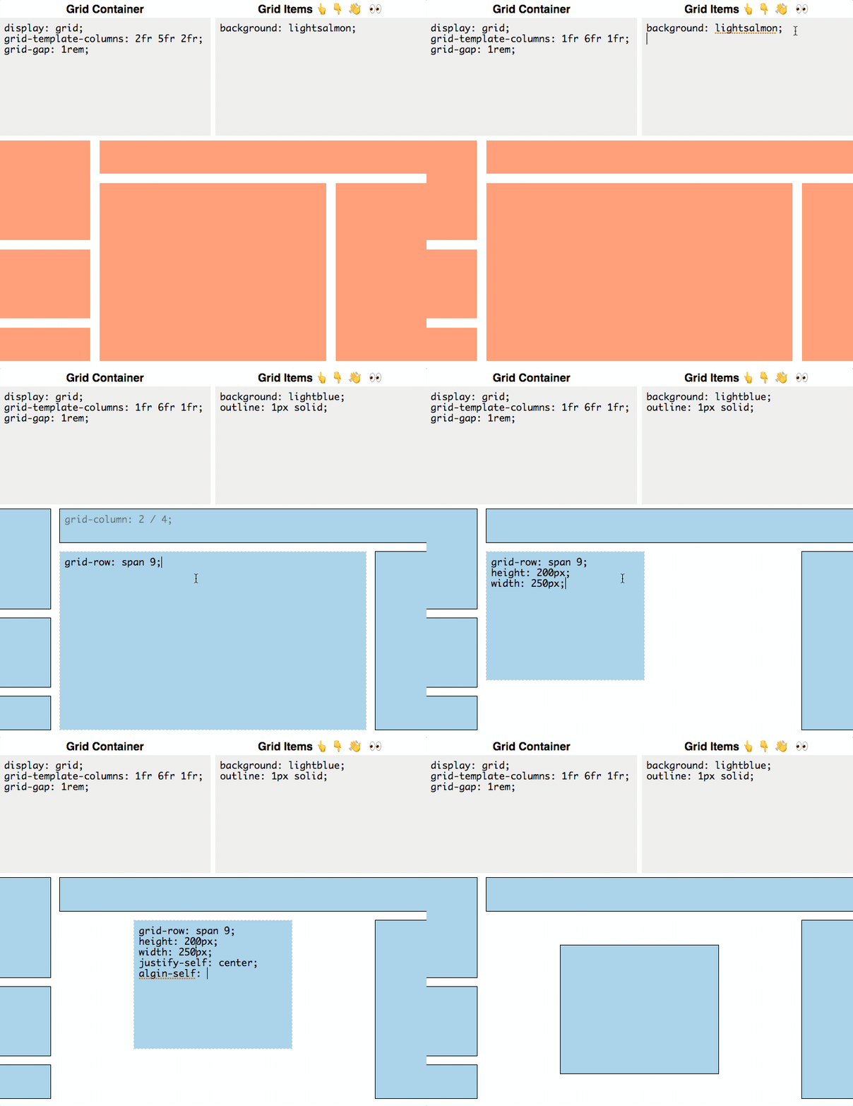
Broken grid is its enhanced form, where the images and texts gets overlapped in a much proper way to present the most adorable and innovative design to the end user. This doesn’t mean that this layout will completely corner’s the grid one, instead it show cases the grid layout in a entirely new format.
Pictorial Representations
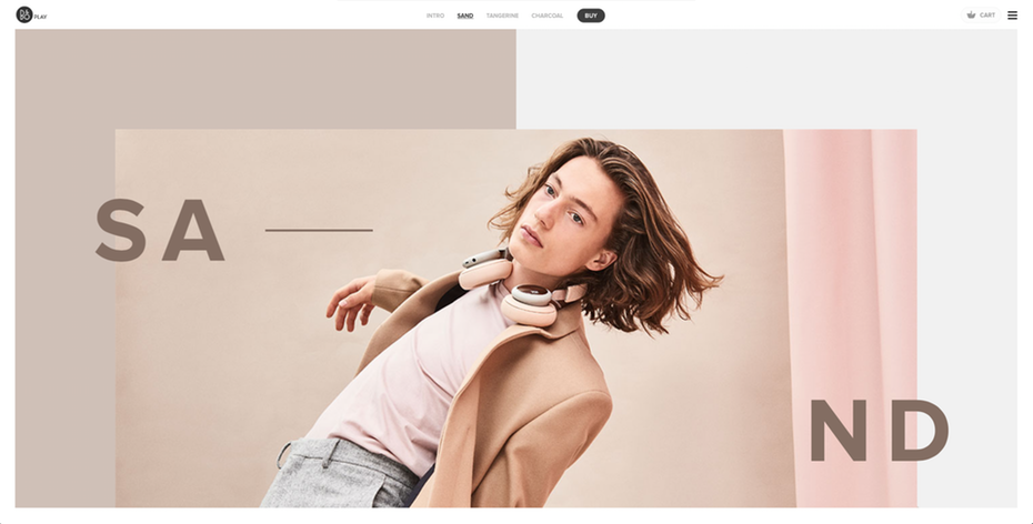
Highly complex and undefined features can easily be defined through illustrative or pictorial representations. It is always believed that pictorial representations are 10 times stronger than the textual representations. Pictorial representation of your concept through web designs can be done through either GIF images or Editable Photography both these representations has their own weight-age.
The first one is highly used to represent product features and descriptions, while the second one is used to represent the product according to the user’s preference. The illustrative formats are highly efficient as they can convey the message just by including a single, appropriate and a bit innovative image
Savage Approach Accepted
Things have changed with design preparation and serving, where designers can create the themes on their own instead of approaching the client every time. Individuality gets explode only when the designer has the freedom of expressing their ideas. This approach will definitely be a surprise but convincing factor to the end user.
Organic Web Designs
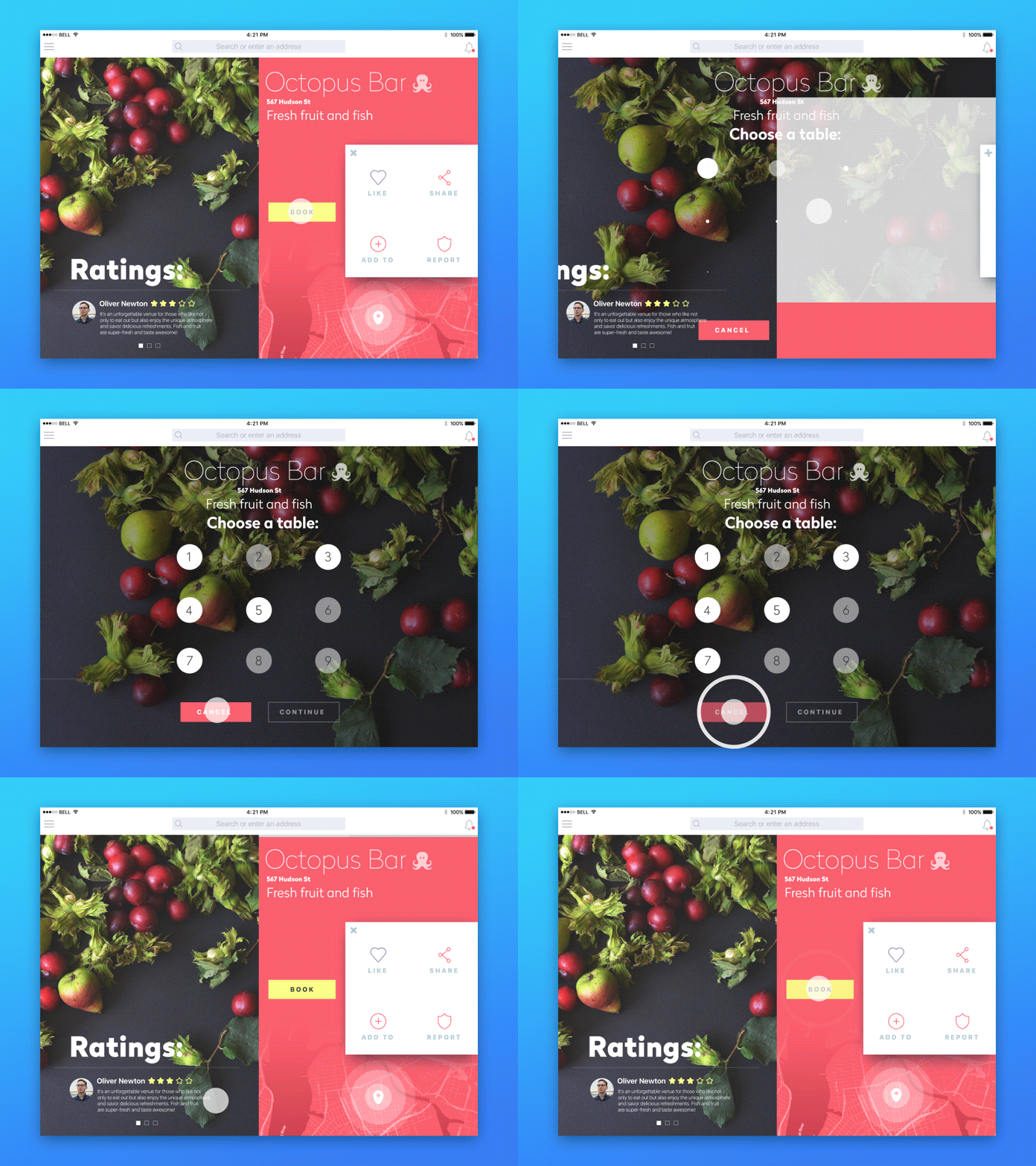
Card based User Interface (UI) model is highly dominated in mobile as well as web designing for years, now this system has been changed where developers and even end users prefer the organic shapes to be present in their page. Previously designers used to create UI in a sharp edged and right angle shape, where as now they are following closed and circular round corners at the bottom of their cards.Even big online giants like Google, Facebook and Twitter has started utilizing this approach. Focus is given towards all the areas, where even background styles are changed into blobs of colors, dramatic diagonal and usage of some cartoon based formats.
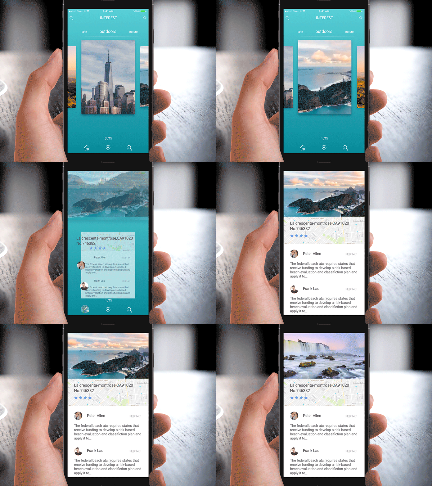
Designers are not purely using organic shapes were they are customizing prevailing formats in their own way to bring out a new design, by twisting the 90 degree angle and creating Stripe homepage. Various other revolutionary approaches were also to be made like bringing in flashing and vibrating colors to engage the targeted audience and create exclusive web designs for disables suffering from color blindness.
Highly Interactive And Rightly Animated
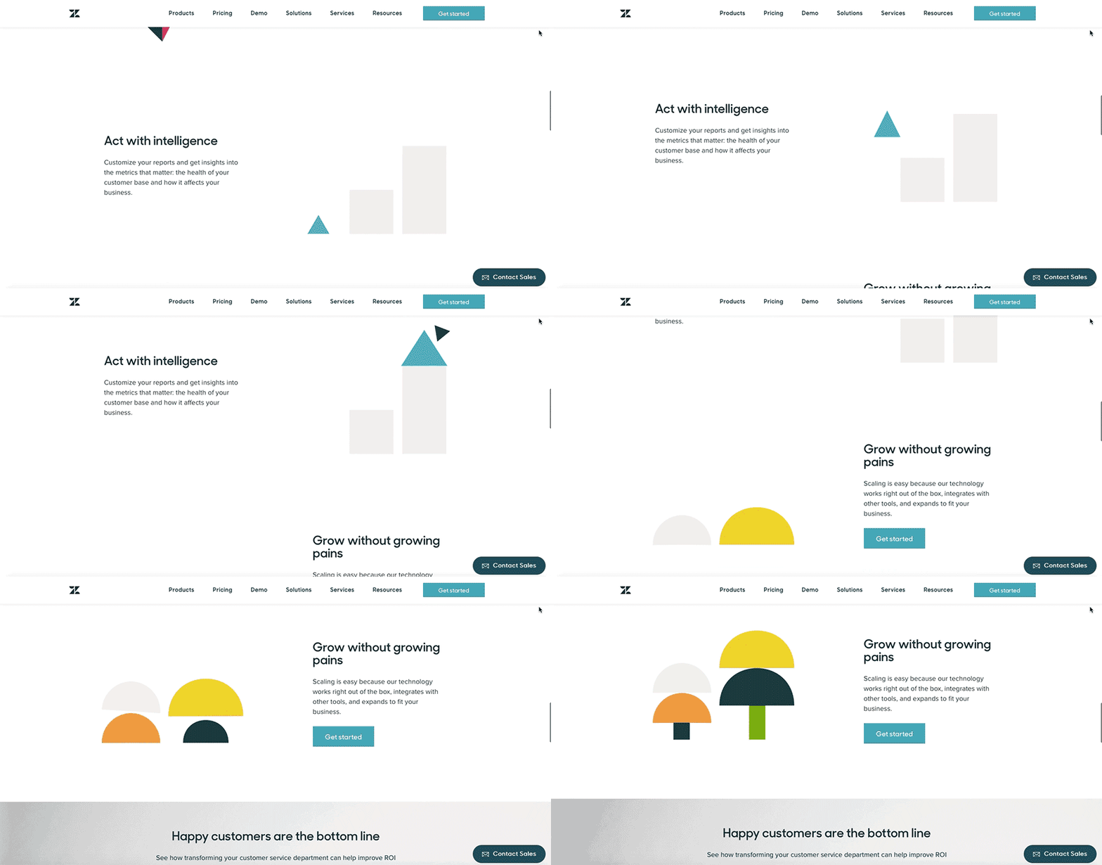
Website content is not about just giving a normal description or detailing regarding the product or service you render to the customers, as now a days customers are very well informative and highly techie about their needs and wants. Apart from this if you need to give anything extra then it has to highly suggestive, deeply informative, keep engaging till the end and create an impact over them.
All you need to do to stand out of the competition is to create the required awareness which is very fresh as an information to them. Talking about animation there is no need to give higher effects always instead you need to provide the right one to navigate towards your content.
Accelerated Scrolling
Fastening up the scrolling rate is one of the trending technique to keep your customers engaged, this web designing feature is highly applicable with fashion and clothing stores opened exclusively in online. As mentioned before the images used in this web designs are tailor made for people suffering with color blindness.
Page Transmutation
Most of the user feel that excitement towards today’s web animation gets exhausted in no time as there is no fancy as expected. The hype which is initially created doesn’t last long until the website visit gets over. To overcome with this issue web designing industry has come up with new idea, where as a user you don’t need to do scrolling and the corresponding pages gets automatically displayed with suitable animations.
Design Maximization
It has been a while since the web design minimization has been introduced and used enough as well, now its time to maximize your site view using web design maximization feature. Industrial experts feel that emergence of this kind of features in a website design is the outcome of brutalism approach by the developer as there is an increasing demand as well from the user side.
Floating Navigation Menus
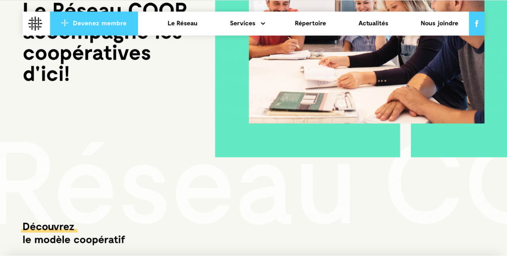
Even the designers got bored with fixed navigation menus in the website, which made them to think different and design floating navigation menus. These menus are added with nav bars, placed below the site and most importantly shadows were added to the nav bar.
Adding Video Format
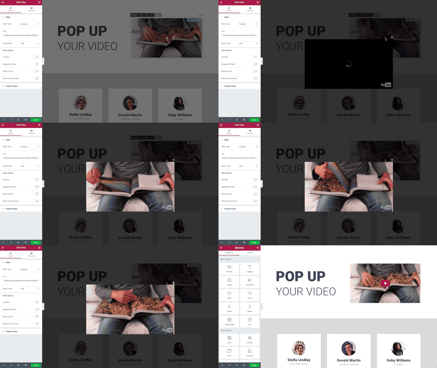
The more and more the complexity rate increases, it gets harder to explain the concept even through images. Including respective video formats is the only way to properly convey your message, moreover it holds the advantage of blocking the user within the website instead of getting redirected to YouTube for watching videos. Even it can be presented with high quality streaming with supportive images and text in order to create awareness among users.

