Overview
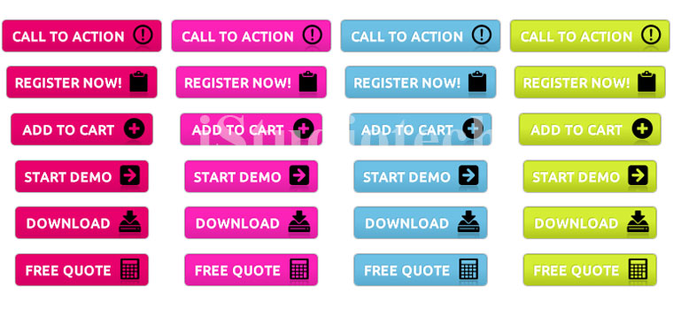
You may have lots of traffic but no sales. , OH Gosh!!! that’s not what you want. It is very important that you have a website which converts well. You want the user to perform the action which you want. This is generally achieved with the help of Call to action. There are lots of Button in UX which are completely clickable and has labels like Buy this now or Click here today. These are called call to action, where you tell the user to perform an action.
If you want your website to be successful then you need to take help of the some good call to action buttons to get users attention. If you do it well you will surely entice user’s action and this will improve in better performance for your website. Designing call to action buttons is not easy. It has to be done in a well thought out way. Hence requires some planning. Not only the designing part but also the text which it has. People also need to pay specially attention on the size of the call to action buttons. Based on your need then you can get it designed from a Web development company in chennai. You should have some money to spend or learn the technology for getting the work done.
Generally the size of the call to action button is 20% more than your company logo size and should be place around the logo to get maximum user attention. This is generally a norm followed by most designer and webmasters, as they want maximum attention on their call to action button.
Another tricky situation can be having multiple call to action buttons. Here you need to decide which one is the most important one. So the more important one will be bigger than the others. Positioning of the button is also very important, if place in the right place on your page can increase the business leaps and bound and hence has to be experimented a great deal. Placement should be done in such a way that it is easily visible to the user. Always look for important ant location like the top of the page, which surely lead to higher conversions as people are going to view your button more than anything else. This can also be done with the help of a good Website design company in Chennai.
- Should be made to standout in the web layout.
- Label text should be very attractive and should ask user for action.
- Colours should be bright or in contrast, based on your strategy.
- Position button high up in the page for better response.
You can make use of this button in the right way and see the change in the way your website visitor responds, always try out different combination and study. You can take help of a professional web design company in Chennai to help you design one of these.


